Heatmap in LibreOffice Calc
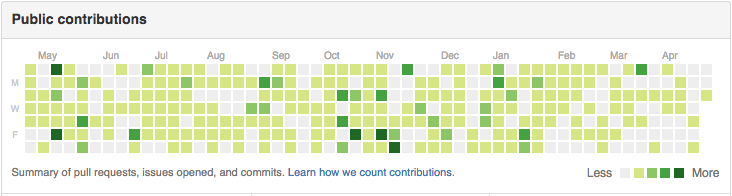
Heatmaps are a data visualisation technique where values are arranged in a grid and then shaded according to their values. If you’ve seen the GitHub commit heatmap, you know what I’m talking about. You can replicate it in LibreOffice Calc, so that you can see whatever data you want in a heatmap; how many hours you’ve spent being productive, how many words you’ve written, and how often you’ve told someone to kill themselves.
- Instead of arranging your values one per row, arrange them in a grid. The exact format is up to you; you can divide 365/N and have them arranged that way, or make it look more like a calendar.
- Select all your cells, and right click on the margins, where the row and column numbers are, to make your cell width and cell height equal. That way, they are square.
- Select the region of values you’d like to colour. In the menu bar, navigate to
Format→Conditional→Color scaleand select the colours/cutoffs you like. For example, if you have a target of 2 hours of piano practice maximum, set the furthest right one the value of 2 hours, and you can set the middle and left ones to half that and a quarter of that respectively.
You can then edit the default styles on the default editor to make the cells white by default, or give them thick white borders to visually sperate them. To make the values themselves disappear so that only the cell shading remains, go to the Numbers tab when you’re editing a style, and under Format Code enter ;;;. Though you won’t be able to see them in their cells, you can still edit their values and see them in the input line bar.
Because screens tend to be wider that they are tall, it’s better if you lay out your values in a grid with more columns than rows; that way you can more easily skim over your data. Have fun.