Microtypography in LibreOffice
This is a guide to making your PDF or print look better in LibreOffice. This is focused on paginated, non-reflowable media. Most can be automated or improved upon through TeX or groff or Scribus, but more people are familiar with LibreOffice than them, so they’re more likely to use them through LibreOffice than learn new software. You can mimic the output of InDesign given time and effort. It’ll never be identical but it can be good enough that a layperson won’t tell the difference, and a professional will have only minor problems with it.
Styles
Most changes should be applied through styles, not directly on text. After assigning a style, you can modify the style instead of the characters. Use a Heading style for your headings, and Text Body for your body text (most paragraphs). You can create new styles as needed; for example, a textbook might need special styles for annotations and figures, with different colour background or specialised formatting.
Font Choice
Fonts are unfortunately not just about aesthetics but also features. Fonts have alternative glyphs, pair kerning, and ligatures that make text more compact and readable. Good starting points are Linux Libertine and Biolinum, IBM Plex fonts, EB Garamond, and Adobe Source fonts. You can also buy fonts if you can afford them; a professional font with many styles can run you hundreds of dollars, but they’re a one-time purchase, so you could buy something and use it in all your professional projects until you die. Don’t use too many fonts; most documents can make do with one or two, but this depends on the document. If you’re writing a programming book, for example, you will need a monospace font in addition to your other fonts.
You can adjust font choice by editing a style. Use Styles → Edit Style for the current style, or Manage Styles and right click on the one you want to edit.
Page Options
Every publisher seemingly has their own default paper size, but most books of fiction are around the size of A5 paper, so that’s a good starting point. That means printing in landscape orientation in A4 and then cutting the pages in half. Otherwise, you can use columns, usually two, maybe three if you’re feeling feisty. If the document is to be bound with glue and has lots of pages, you will need significant margin on the sides, 2cm or so. The necessary margins depend on your binding method and printer. For strictly digital distribution, you can afford smaller margins.
You can adjust your page in Format → Page Style. You can have several page styles, with a different style per page.
Spacing
Paragraphs in paginated media should have first line indents and no extra spacing between them (the opposite of scrolling media). Adjust line height so that it is neither too wide or too narrow: 115% to 150% covers most usage, but this depends on your font and personal preference.
For the first paragraph after a heading or a break, you don’t have to indent the first line. You can also have drop caps in the beginning of a section. Additionally, you can use small caps for the first few words. You should create a special style just for first paragraphs in that case. When editing a style, under organiser, you can customise Next Style so that, while typing a heading, pressing Enter will make the next style a First Paragraph, and in turn Text Body follows the First Paragraph.
You can adjust spacing when editing a style under the Indents & Spacing tab. Drop caps are configured through the Drop Caps tab.
Small Caps
Small caps are used for emphasis, to indicate formal names, or where all caps would be annoying, for example “NATO”. You can enable small caps when editing a style under the Font Effects tab by changing the Case, or through Opentype features by clicking Features in the font selection tab.
Old Style Numerals
These are alternative glyphs for numbers so that they blend better with surrounding text. You use them by appending :onum=1 to the font name or through the Opentype features button.
Space characters and breaking
LibreOffice allows you to insert non-breaking spaces, non-breaking thin spaces, and non-breaking hyphens. You can customise their keyboard shortcuts under Tools → Customize. They are used when you want spaces or hyphens, but don’t want LibreOffice to break the line. Non-breaking thin spaces also have special usage in French typography. Consult your language’s style guide.
It is generally advised that you do not double space sentences, but if you must, you should use the em space character (U+2003). You can copy-paste it from Wikipedia and add it as an autocorrect option you can remember, like :em:. Autocorrect is customised in Tools → Autocorrect → Autocorrect Options and can apply per-language and globally for all languages. Keep in mind that double spacing paragraphs messes with the ideal greyness that you’ll be trying too achieve in your body text and can create horrifying rivers.
Languages have their own rules for spacing in quotes and around punctuation, and you should follow those rules. English has no unified standard, so you have more freedom, but you should be consistent. There are several style guides available as starting points; for example, EU Parliament has one.
Manual spacing adjustments
You can change the spacing of letters and the sizes of glyphs to make text flow better. These are available in Format → Character in the Position tab. You should make a shortcut for it in Tools → Customize because you will use it a lot. Use these with care, as it can make your text unreadable. Only make marginal adjustments (±3%, or ±0.3pt). You can also make minor adjustments to the page itself through additional page styles, by changing margins. A final option is changing the line height slightly; this is discouraged but it is probably unnoticeable if you apply it to entire pages at a time.
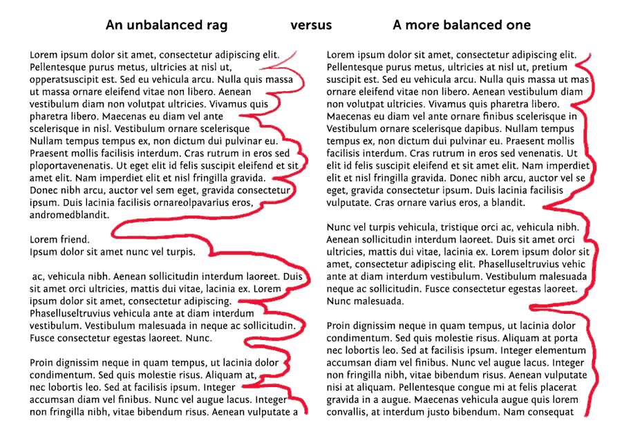
You want to achieve three things: a) every line should end at about the same point. b) The last line of a paragraph shouldn’t be one word (orphan word). c) When a paragraph breaks between pages/columns, the remaining paragraph at the top of the next page shouldn’t be a single line (widowed line). You can use stricter guidelines if you want, but these are the minimum. LibreOffice can do some of the work for you; when editing a style, orphan and widow control can be configured in the Text Flow tab.
Using a left alignment (flush left), it will be very obvious which lines are the most problematic because they will have far too much space on their right. Select a bunch of text, and adjust its character properties until you are satisfied. Not all text can be salvaged, unfortunately. You can manually break lines, columns and pages if need be. You can also manually add soft and regular hyphens. Check or change the keyboard shortcuts in Tools → Customize.
When you’re done, you can justify the text if you want. You can also try looking at the page from a farther distance to spot rivers.
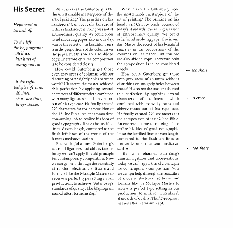
Hyphenation
Hyphenation can make your life easier, especially for narrow columns of text. However, it also breaks the rhythm of the sentence, so not everyone likes it. With effort, you can make do with no hyphens or very few hyphens, but life isn’t always simple and every text has its own challenges.
Automatic hyphenation can be enabled in the Text Flow tab when editing a style. You can adjust maximum consecutive hyphens and minimum sizes for the hyphenated words. Of course you can also hyphenate manually as needed.
Hanging punctuation
You can enable hanging punctuation by appending :hang=1 in Graphite fonts. As far as I know this includes the G versions of Biolinum, and Libertine.
Additional Opentype features
You can browse and select additional features in Opentype fonts by clearing the Features button on the font selection tab.
Distribution
When you’re done, export your document as PDF. PDF is really the only format capable of preserving subtle typographic features across operating systems and devices. Some of these features can be replicated in browsers, but there are no guarantees browsers will render fonts the exact same, so random things can and will break here and there. However, browsers come with PDF support, so it’s not that bad.
An interesting thing you could do if you’re only concerned with digital distribution, is design your document with the dimensions and aspect ratio of a smartphone in mind, so that looks good despite their small size. Users won’t be able to reflow text, but if your document has some particular layout that HTML or ePub can’t preserve, or if you are anal about typography, it will work out well enough.