I know fuck all about about design but I need my page to look good: the style guide
Are you new and ignorant to this web/design/web design thing? Don’t have hundreds of thousands of dollars to waste on college, seminars, and conferences? Do you have better things to do with your time than browsing inspiring mockup UIs on dribbble that you can leach off of? This guide is for you.
Motherfucking Website
If you just want to put an article up, this is all you need to do:
<!DOCTYPE html>
<html>
<head> <meta charset="utf-8"/>
	<meta name="viewport" content="width=device-width, initial-scale=1"/>
	<title>My Motherfucking Article</title>
</head>
<body>
	<h1>My Motherfucking Article</h1>
	<p>My motherfucking paragraph.</p>
</body>
</html>
It won’t be the most stylish thing in the world, but it’ll work. If you don’t want to be bothered at all, this is good enough, and modern browsers will deal with it just fine with reader mode and so on. Besides the Motherfucking Website, Dan Luu also uses this principle.
Whitespace
The general principle is information density. You don’t want your content to be too dense, because then the human eye gets confused, even if the reader is focused. Different material and personal preferences warrant different densities. You don’t want it to be too sparse because scrolling often is annoying and ruins the immersion of reading. Personally I want at least 100 words to fit on the screen of a smartphone and 250 on a desktop.
By default, web pages have no maximum width, so sentences will run on for eternity, or as long as the screen can fit them horizontally. This makes for a terrible reading experience if the screen is wide, as most are. Regardless of how long you like your lines, you should set some kind of maximum width on your body text. A good starting point is 30em and I’m personally okay with up to 55em, but this can depend on your font.
Either ship what you like as a web font, or use the default categories of serif, sans-serif, and monospace. Sans serif typefaces are by far the most popular in the current year, but you can’t go terribly wrong regardless. Font sizes are also debatable, but a good range is 12-18px. However, if you target dyslexic users, strongly consider comic book typefaces (yes, even Comic Sans) or typefaces specifically designed for dyslexic readers.
At least for paragraphs, do not use a line height of 1.0, as it is too dense even for the most hardcore material. 1.15-1.5 is a good range.
You want at least some margin between the edge of the display and your text, as it’s uncomfortable and awkward for the edges of the font to touch the bezels. Even 6 pixels can work wonders.
Flush left vs. Justify
By far the best text alignment is flush left with no hyphenation, for all content in all contexts. The only exceptions are fixed, paginated mediums (like printed books) if and only if you are willing to make manual typographic adjustments.
Never justify without hyphenation. Justification works by adding or removing extra space between words, and the fewer words there are, the fewer opportunities exist to do this. If a sentence has too few words relative to its visual length, this results in there being far too much whitespace. Hyphenation effectively breaks long words into smaller ones, reducing these artefacts.
You can hyphenate automatically with CSS and setting a document language. However, hyphenation support in browsers is poor, so you will often get no hyphenation. Moreover, controls over the hyphenation even poorer, so you will often get excessive hyphenation that breaks the rhythm of the text and makes it more difficult to read.
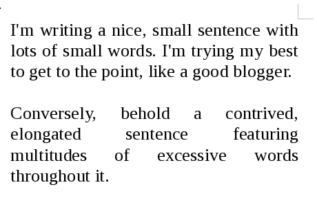
Even if you do hyphenate, you will often get “rivers”, which happen when word spacing is stretched in multiple successive lines in roughly the same vertical position. It looks like there’s white rivers running through the text. The following picture makes it obvious:
All of these can be solved with manual interventions in hyphenation, letter spacing, and word spacing. They’re extremely sensitive to the language used, sentence length, word length, and of course page size, which is completely arbitrary. The shorter a line is, the more obvious they become, such as when reading in a portrait orientation on a smartphone. Smartphones have an aspect ratio of 16:9 (and 2:1 nowadays), which is significantly narrower than most books for example.
You avoid all these problems by flushing left and not hyphenating.
Colour and style
Light grey on slightly darker grey is terrible. You should have high contrast for your text, not just for accessibility, but also because it’s mandatory in the web standards. Always underline links (and only links), always give links an identifiable non-grey colour, and ideally also make them bold.
You should use few and consistent colours which will give your page a visual identity. If you have no idea what to do, Adobe provides a Colour Wheel utility, and you can also use existing palettes if you aren’t feeling creative.
Widgets
Never use fixed headers and footers, unless what you’re creating is some sort of editor where actions need to be available at all times. “Intelligent” headers that hide automatically on scroll are less bad but still bad. Visitors aren’t there to look at your cool navigation buttons and site icon, but to read your content, and your header is getting in the way of content.
Never highjack scrolling behaviour, such as to hack in “smooth” scrolling.
Never highjack clicking behaviour.
Never show popups unless legally required to. Nobody cares about your mailing list. Kill yourself.
Never hide functionality under drop down menus and hamburger menus. They’re annoying and bad for accessibility.
Only paginate individual articles if they genuinely are very long and load a lot of resources. Clicking is effort not spent reading, and you want people to read your shit. 5,000 words per page is a good maximum.
Never optimise for ad revenue, because the ad industry is a bubble and you’ll make orders of magnitude more money off Patreon if you ever do become moderately popular.
Final Thoughts
If you followed these tips, your site is more readable and user friendly than pretty much the entire web. Congratulations.
A good rule of thumb for adding stuff to your website is if it makes your website better than the Motherfucking Website. For example see the Best Motherfucking Website.
The web exists to serve your content, and good design is by definition only the design that enables enjoying your content. It is never by itself content.